collaborative photography
role
UX Designer
Web Developer
software used
Adobe XD
Photoshop
Illustrator
Github
languages used
Elm
HTML
CSS (BEM)
duration
2.5 years
problem
There is currently no solution to manage and collaborate on photos as a small, private group, in one place.
objective
To find a cross-platform solution that allows users to manage and share their photos with others in a secure space.
solution
Create a consumer-oriented web, iOS and Android application that focuses on:
Photo management across different albums
Creative ways to share, curate, cull, edit and interact with sets of photos
Elegant, intuitive UI that non-pro customers can navigate, while maintaining the company voice and brand
Utilize machine learning to reduce the amount of manual labor that modern day photo applications require
All of the initial project research was led by myself and one other designer, with some help from our two design interns. Our process primarily consisted of:
Find internal research docs involving collaboration and photography
Meet with other internal teams that work in the consumer or photography space
Conduct a competitive analysis across other photo sharing applications
Create journey maps and personas to help identify user painpoints and wants
Receive feedback on initial prototypes from other designers in the company
Hold internal user testing sessions
Our initial research began with meeting with 10 potential users to learn about their current interactions with photography and different methods of sharing photos. We compiled our key findings into one document for future reference. Our first pass of research concluded with taking two separate trips to Portland, OR where we (myself, another designer and our product manager) met with existing photographers who walked us through their current photo curation and sharing workflows. All of the interviews were filmed and our findings compiled in order to help guide future design iterations.
Some of the main findings were:
Users want a "one stop shop" to upload, manage, share and interact with their photos
There is currently no easy, intuitive way to share photos with all types of people due to: differing levels of understanding of technology, different operating systems and devices, people don't want tp make another account or download another app, etc.
Users want to know that their photos are safe and can be easily shared to small, private groups of people
I worked with two other designers to create several personas (10 in total) under 3 different photography use cases: 1. Wedding photography, 2. Soccer parents, 3. Friends taking a trip together.
The entire document of personas can be found here.
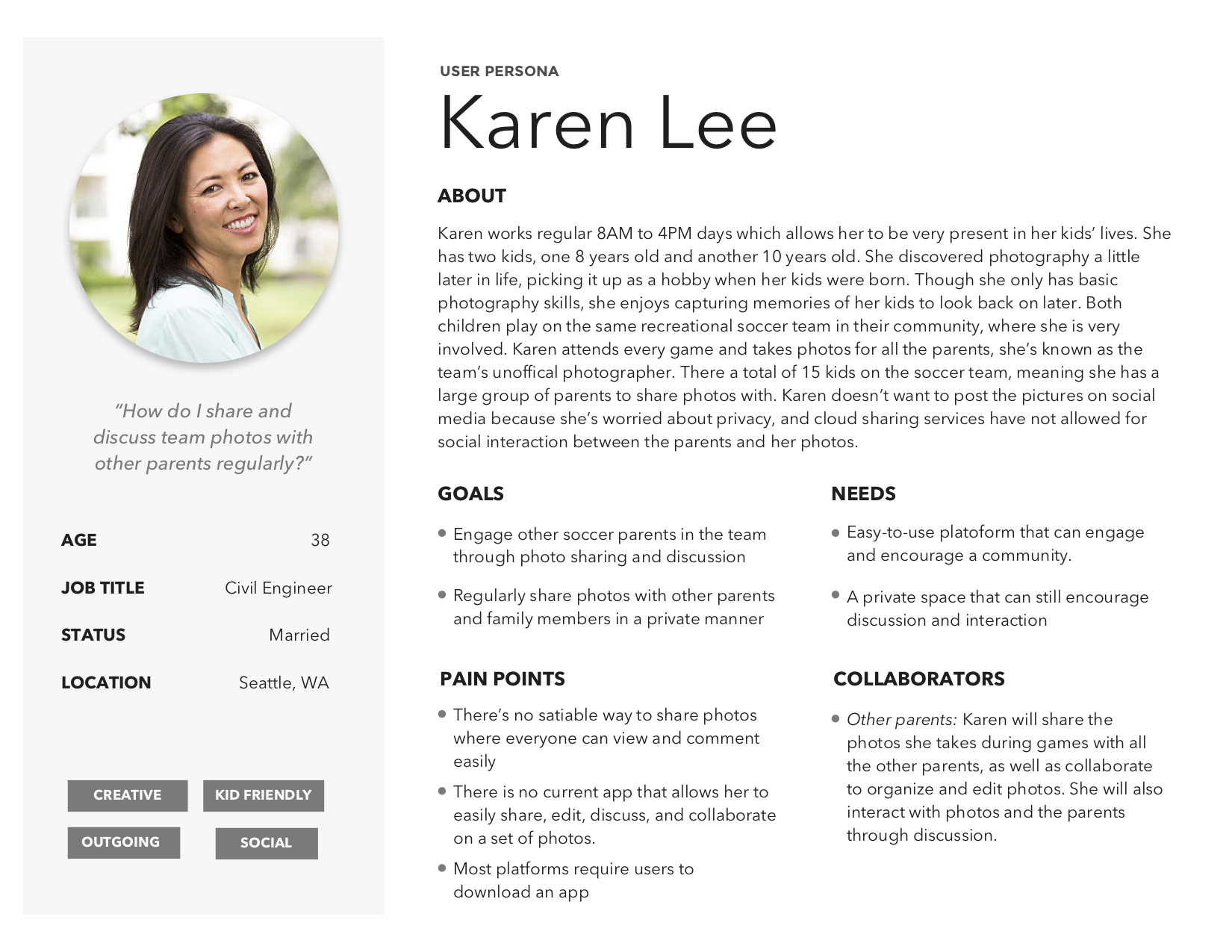
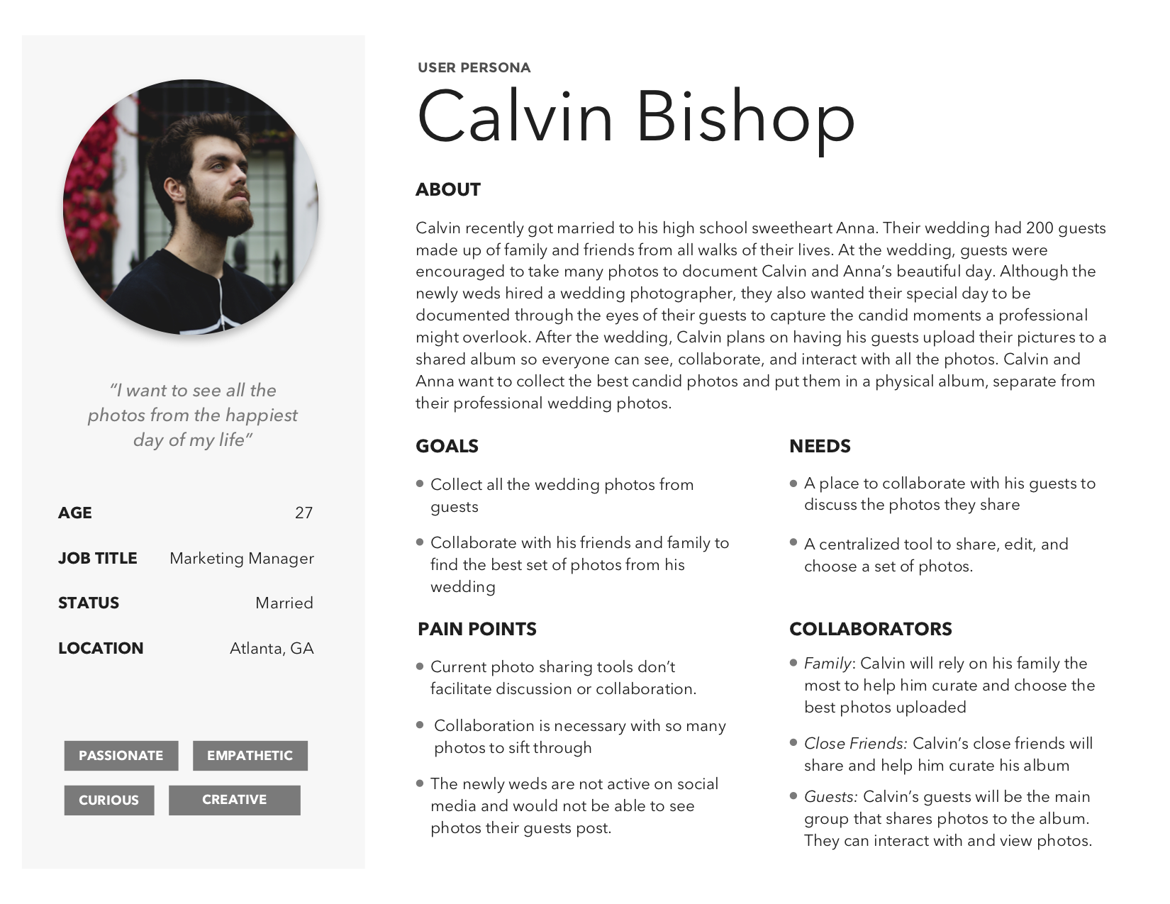
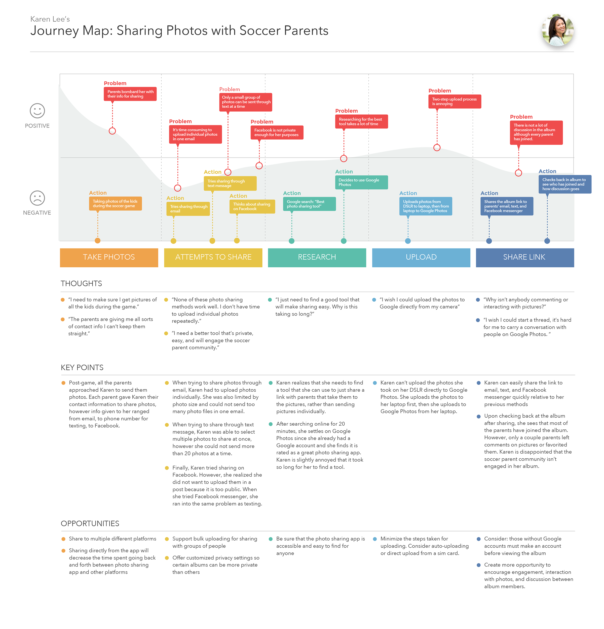
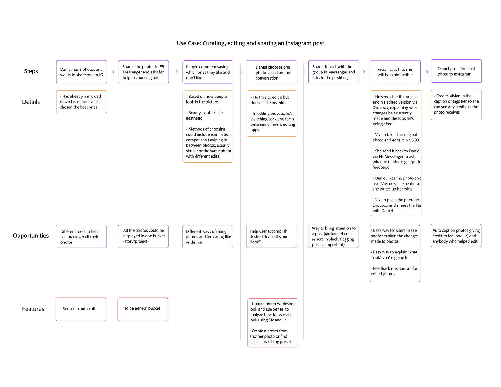
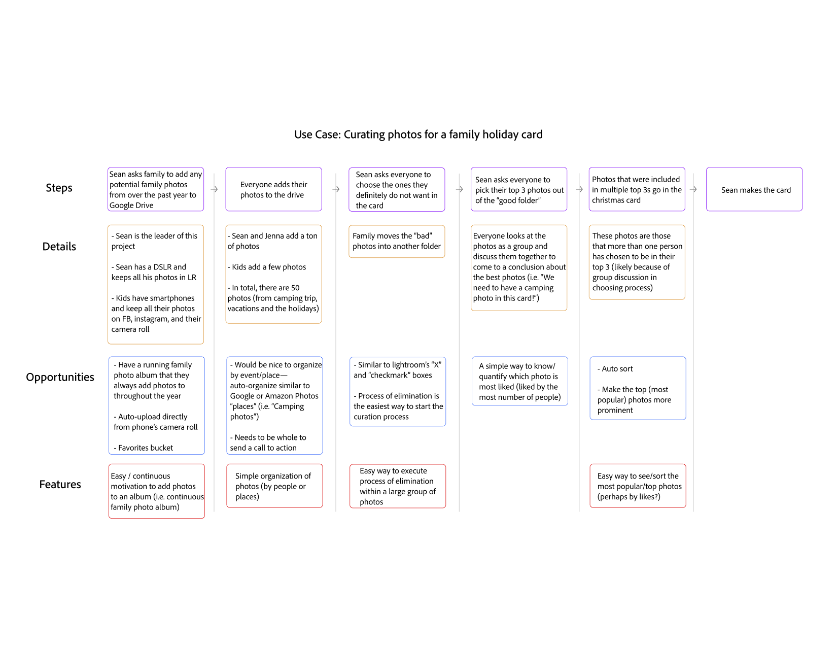
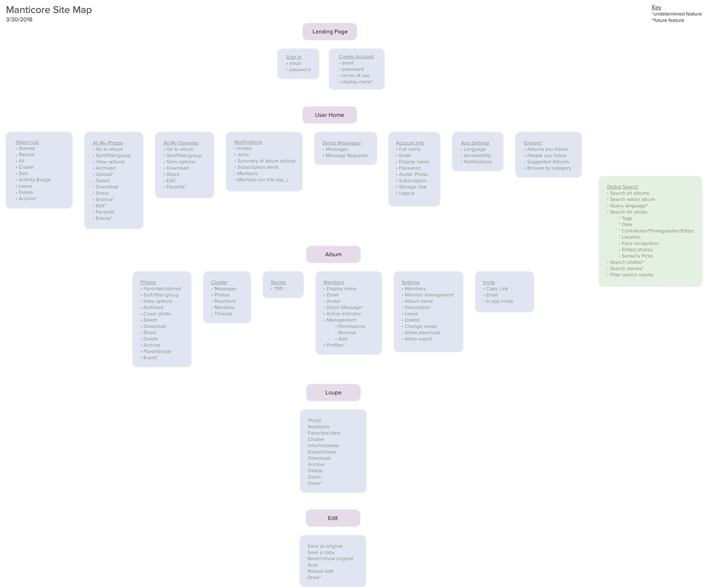
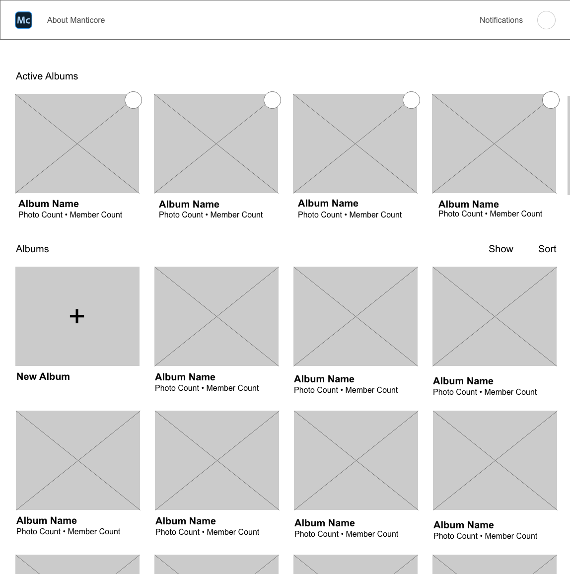
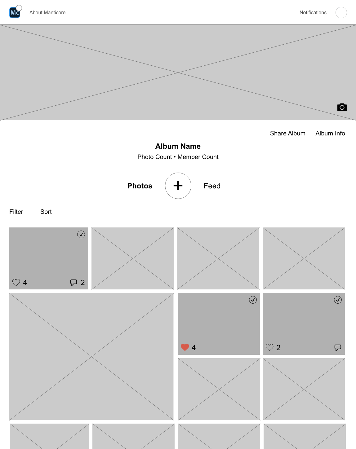
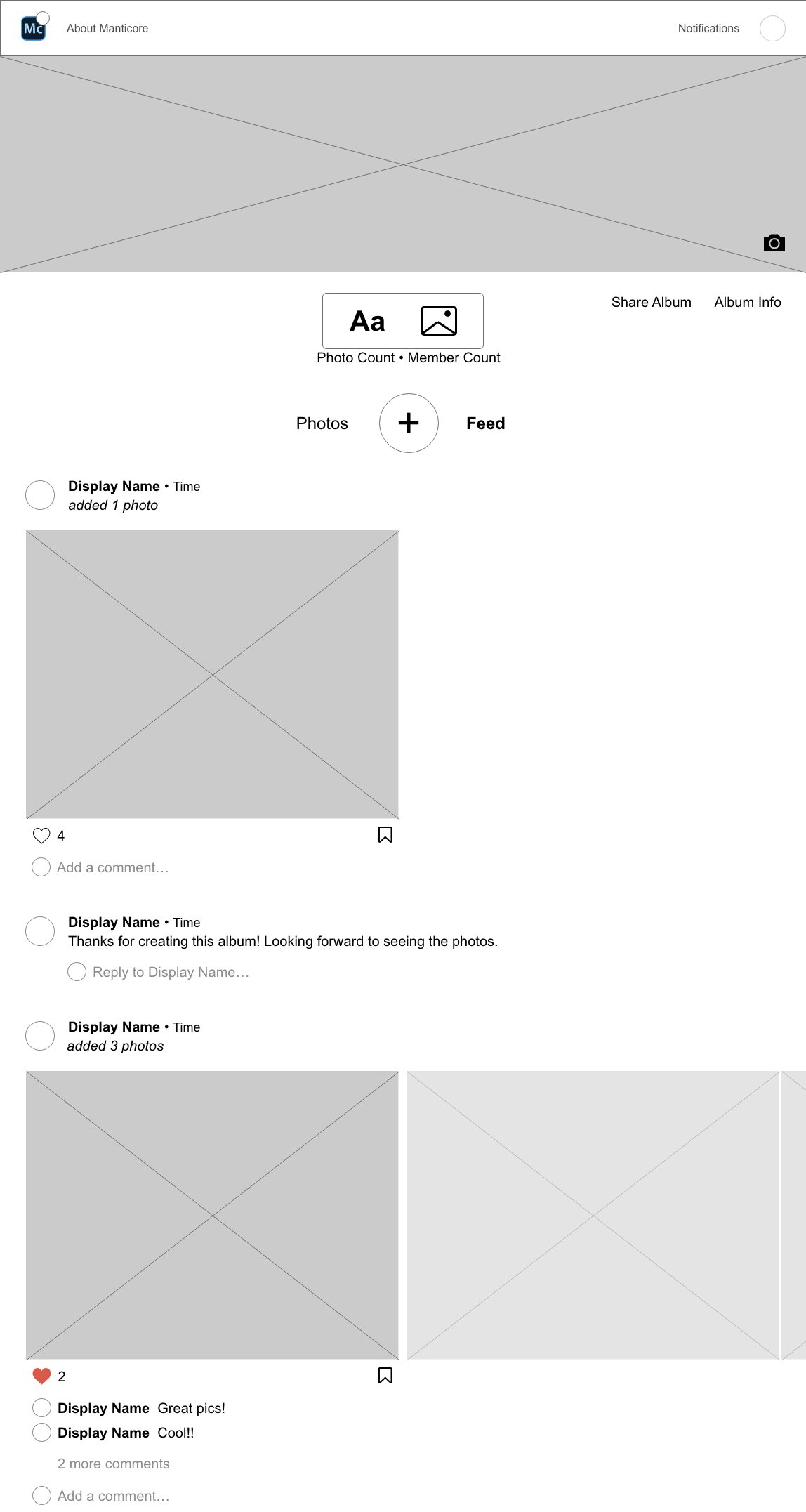
Using the resources we'd compiled so far, one other designer and I collaborated to create an initial outline of what we envisioned Manticore's design guidelines and brand traits would encompass. A few descriptors for our design guidelines were: minimal, integrated, inherently social and inclusive. While some of our brand traits were: approachable, encouraging, organized and expert (but not superior). We consistently referenced these guidelines throughout our design process.
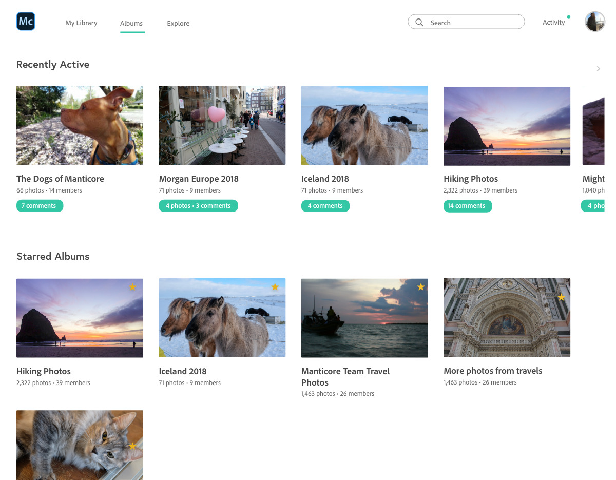
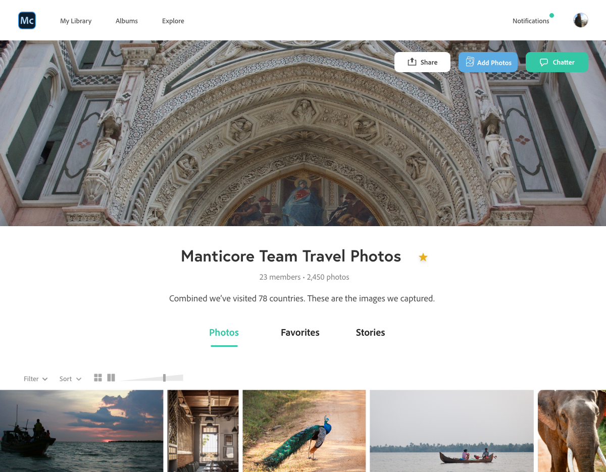
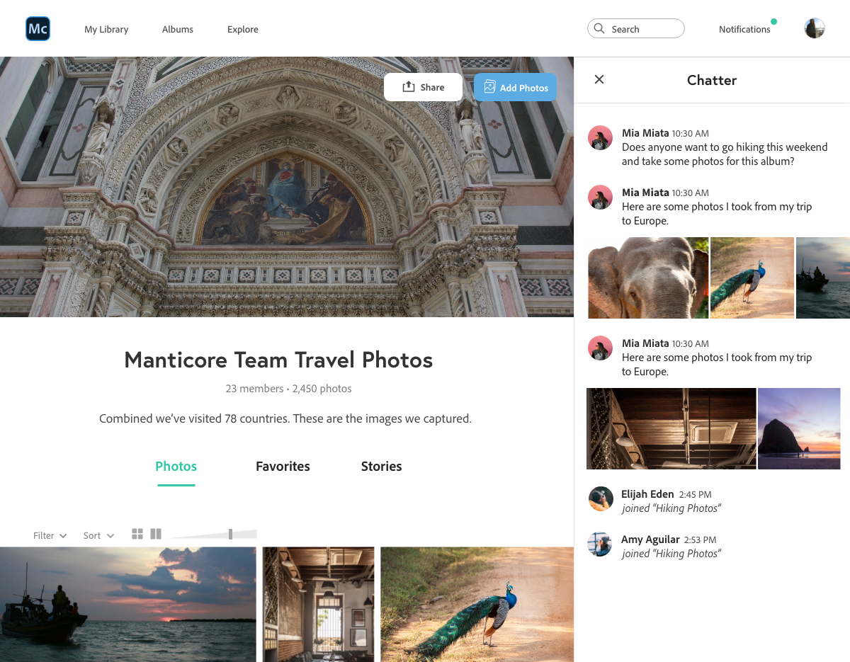
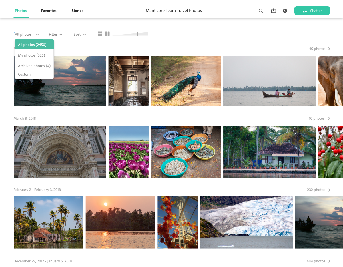
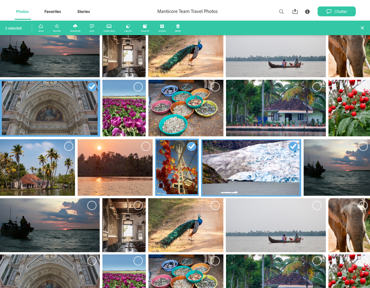
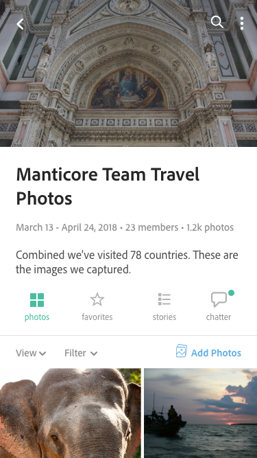
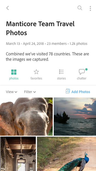
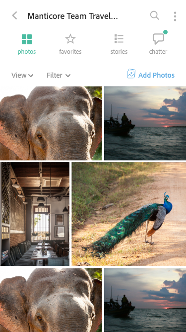
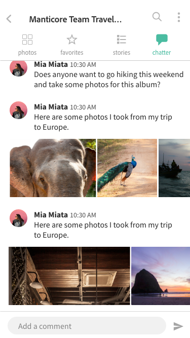
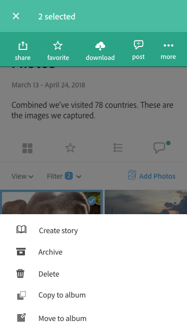
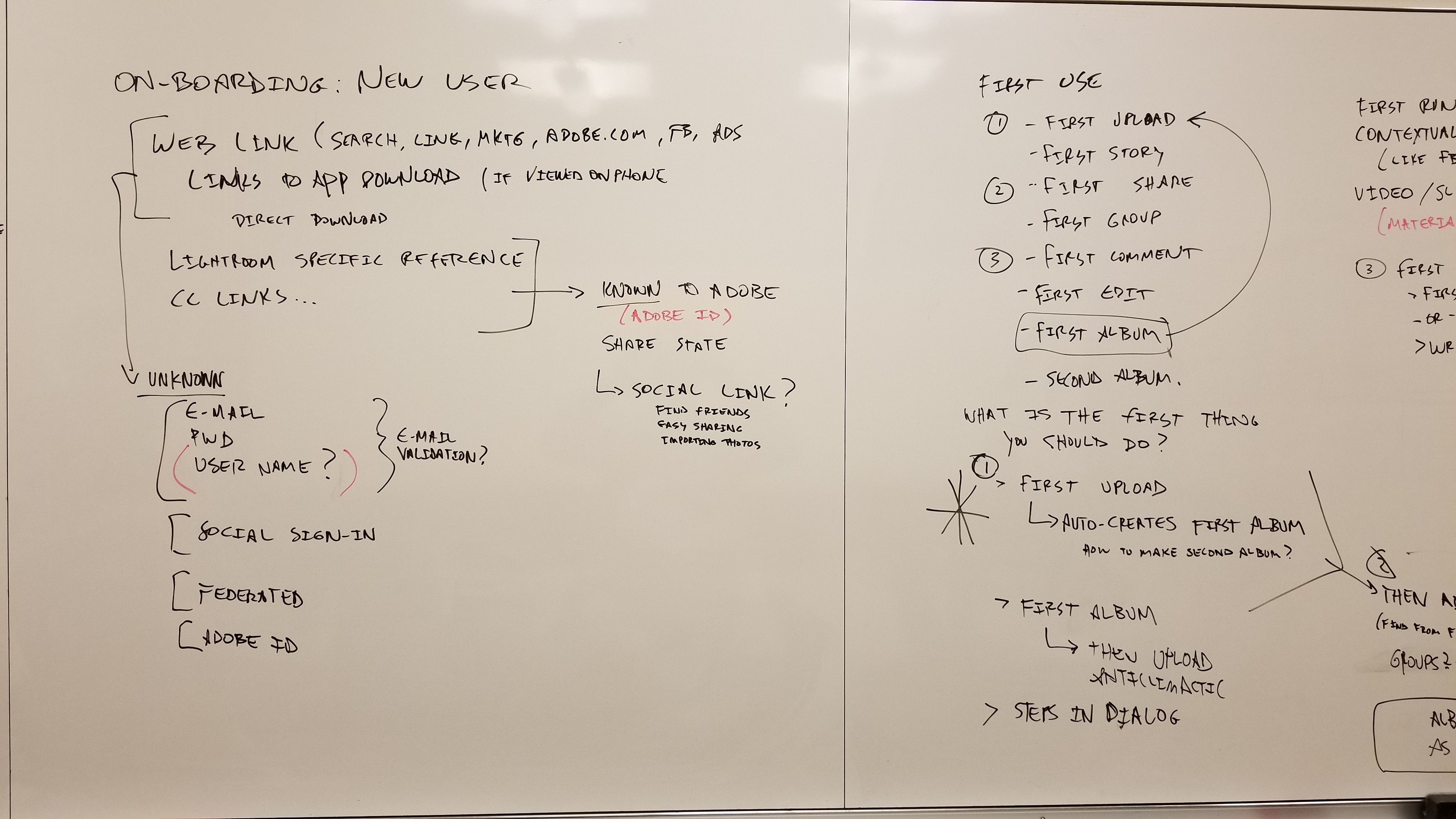
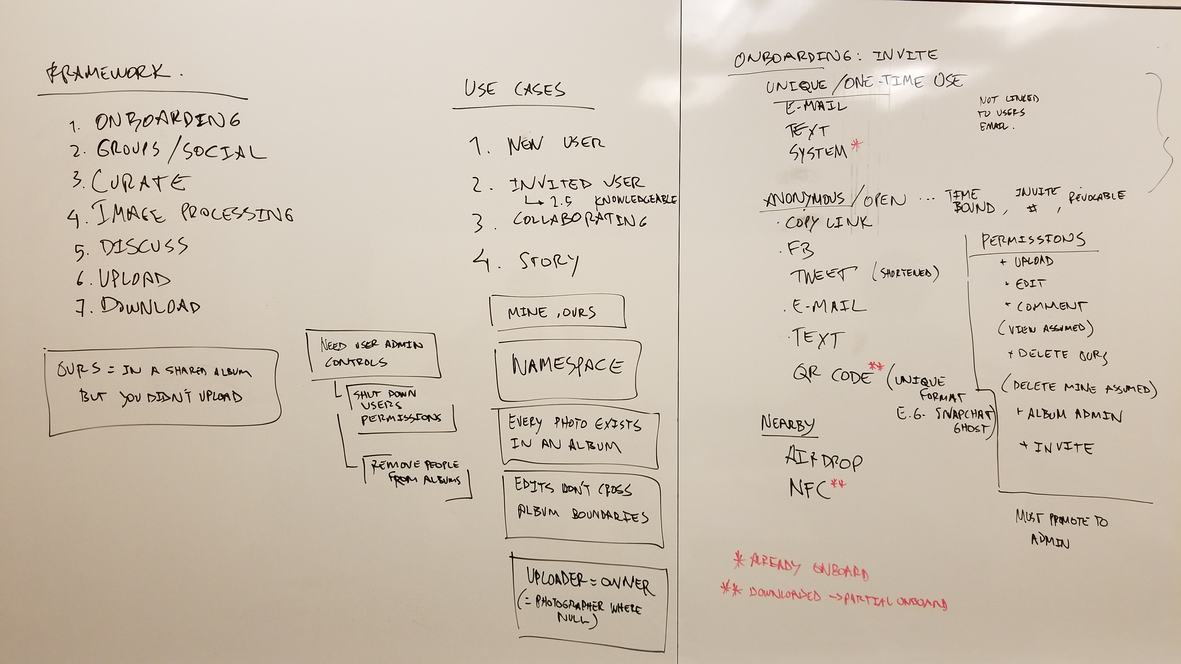
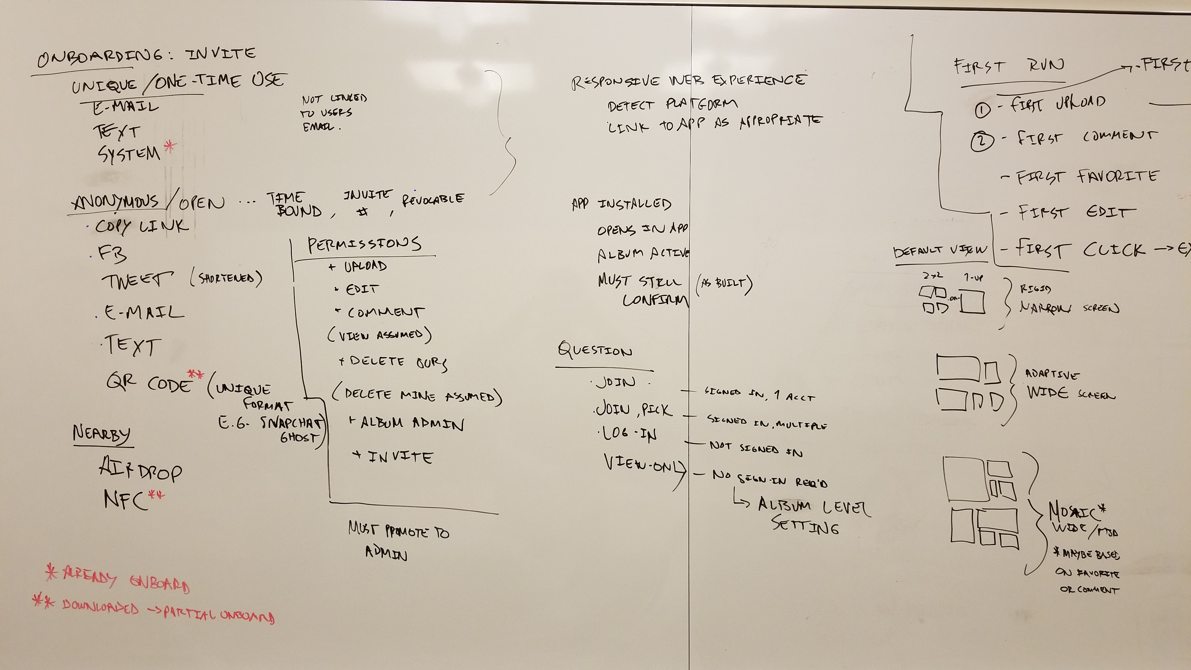
After finishing the first iteration of prototypes, I had the opportunity to spend 2 days with the Director of Enterprise App Design, who gave feedback on the current state of our application design and led brainstorming sessions. We walked through designing for the First Time User Experience (FTUE) and how to know when a product is "good enough" for V1 shipping in order to get real customer data and insights. We used most of this feedback to design our second version of the application, which is what ultimately went in to production.
Ideas on where to go:
Adopt a more thorough UX process (e.g. include usability testing in every milestone)
Innovate in the collaborative space (curation, multi user editing, easy sharing)
Start designing animations and delightful micro-interactions
A more thorough summary of our time together is here.
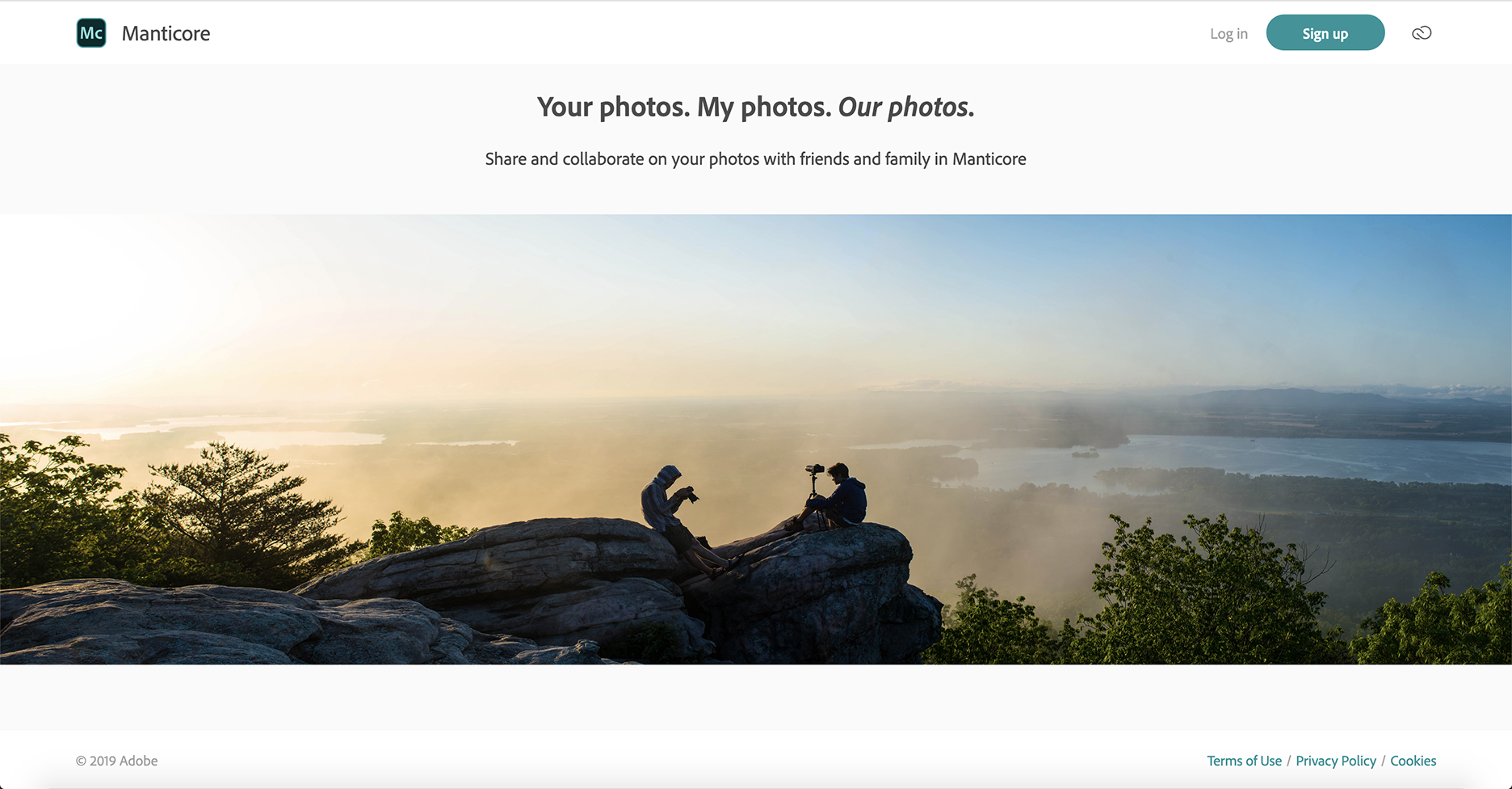
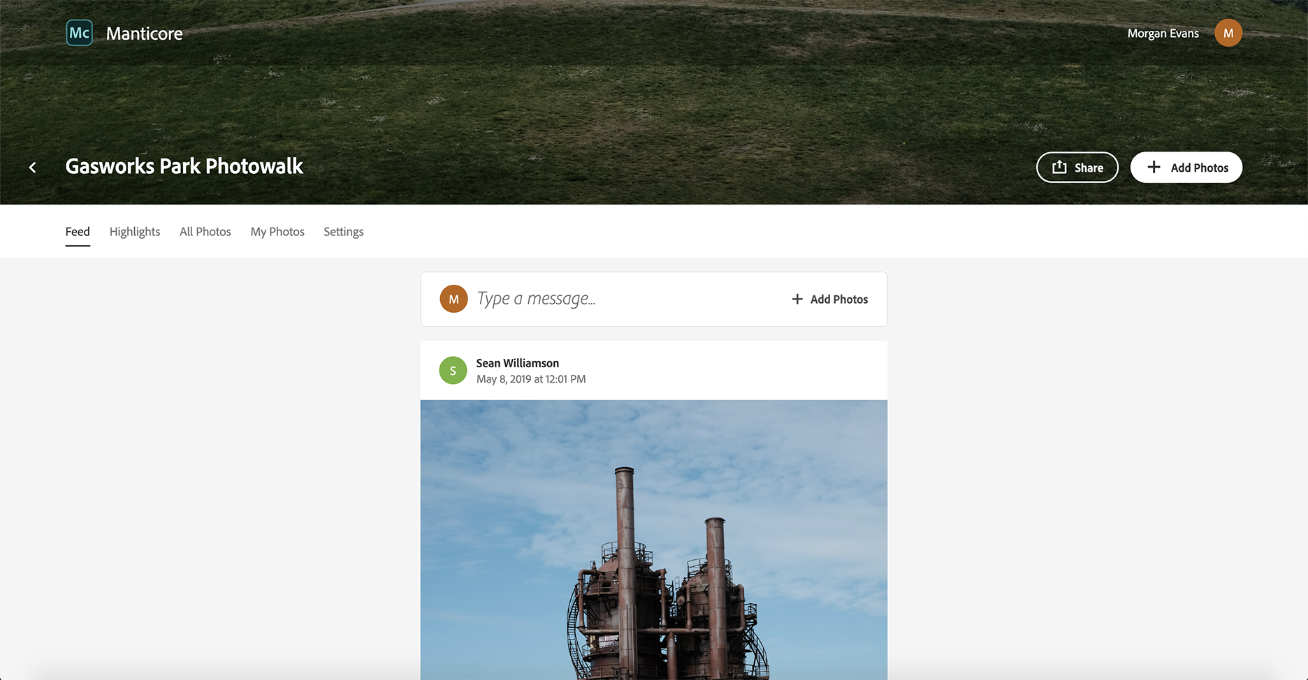
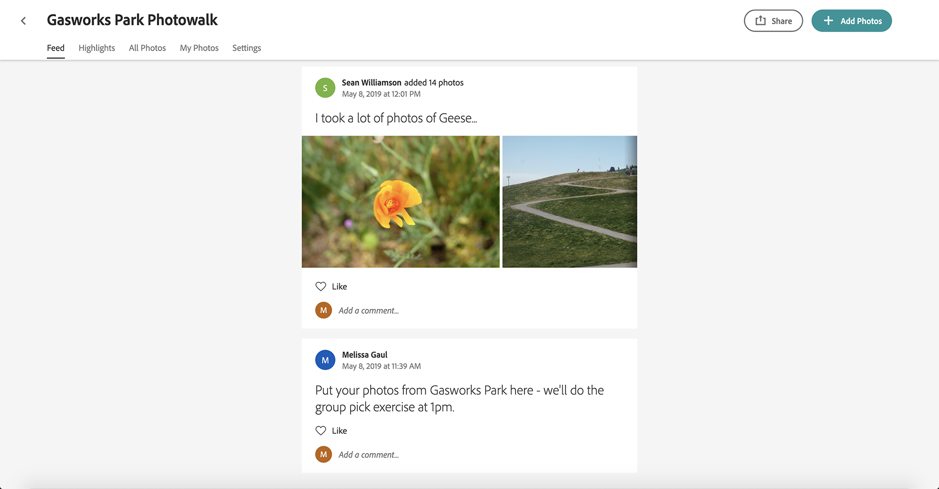
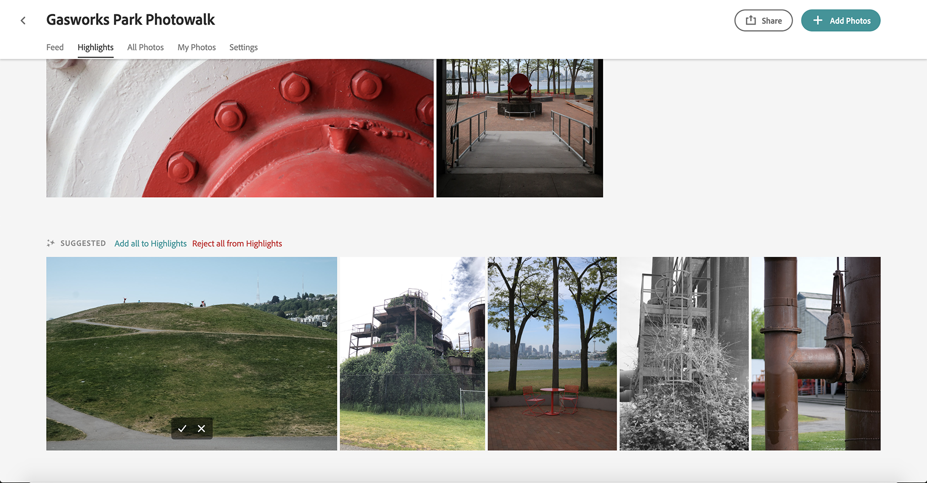
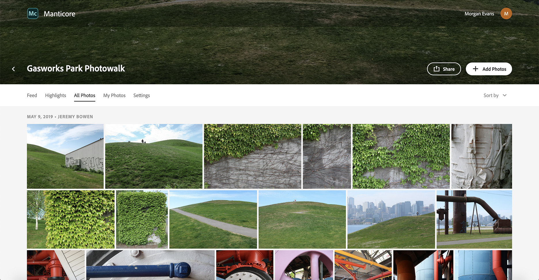
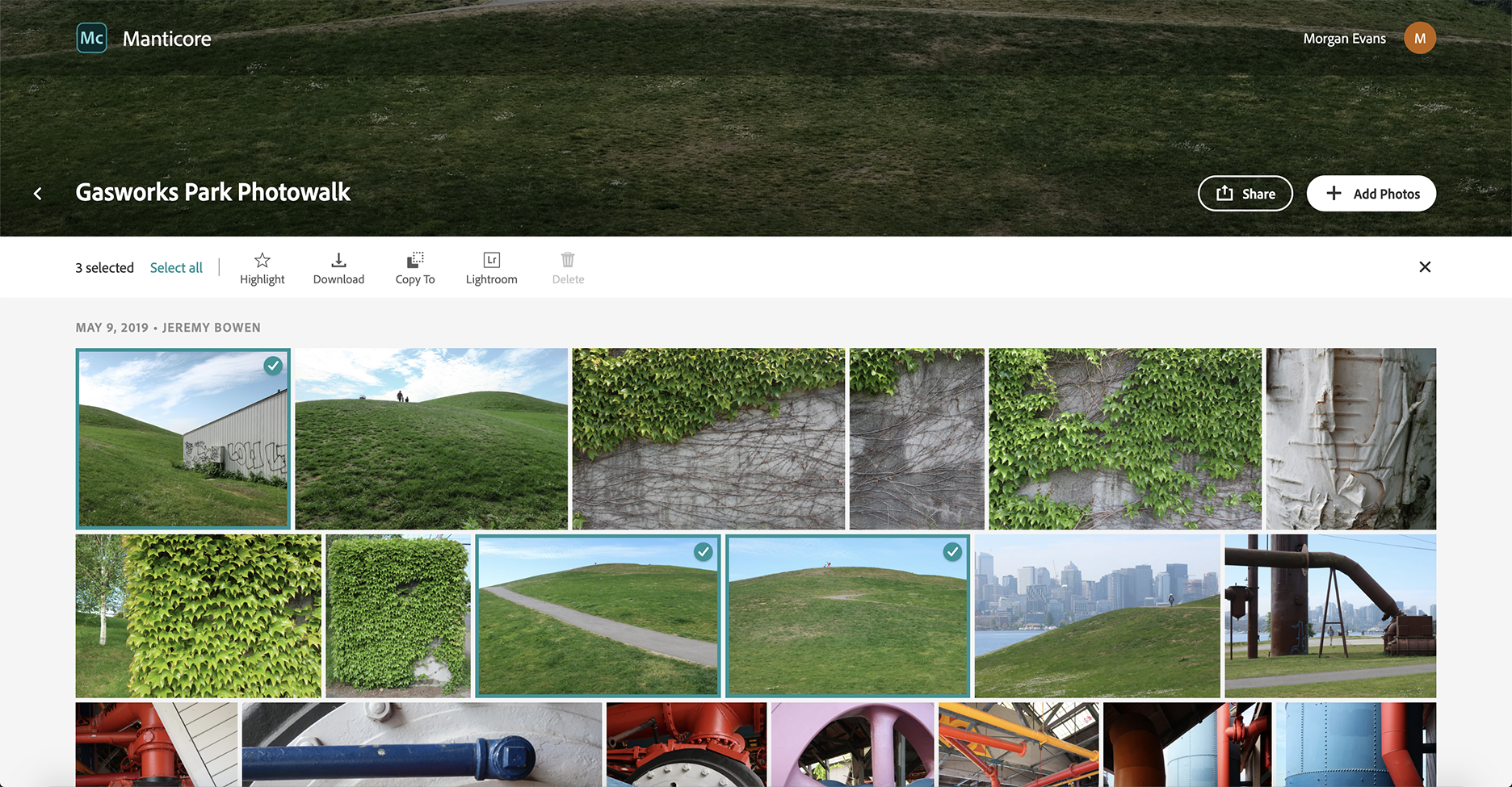
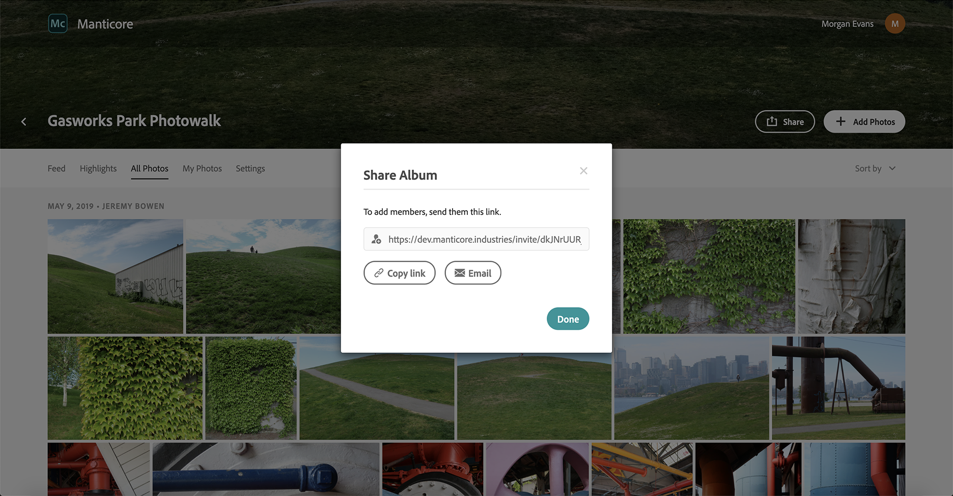
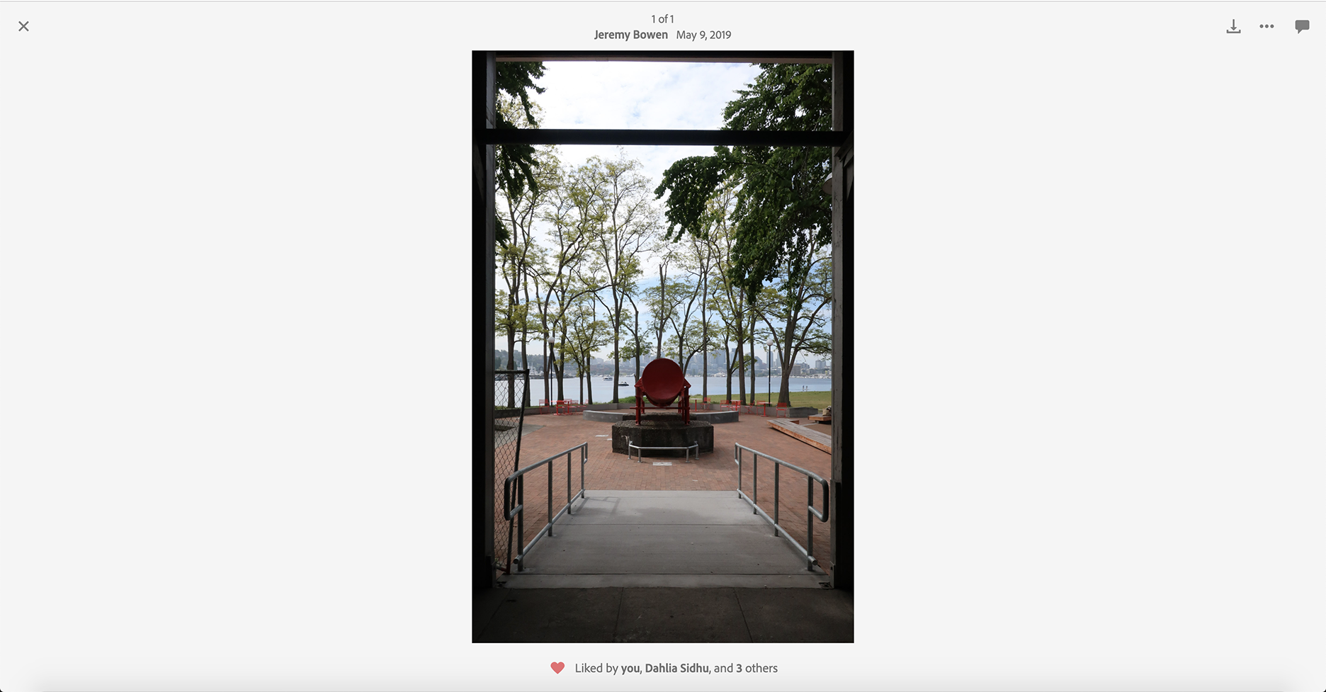
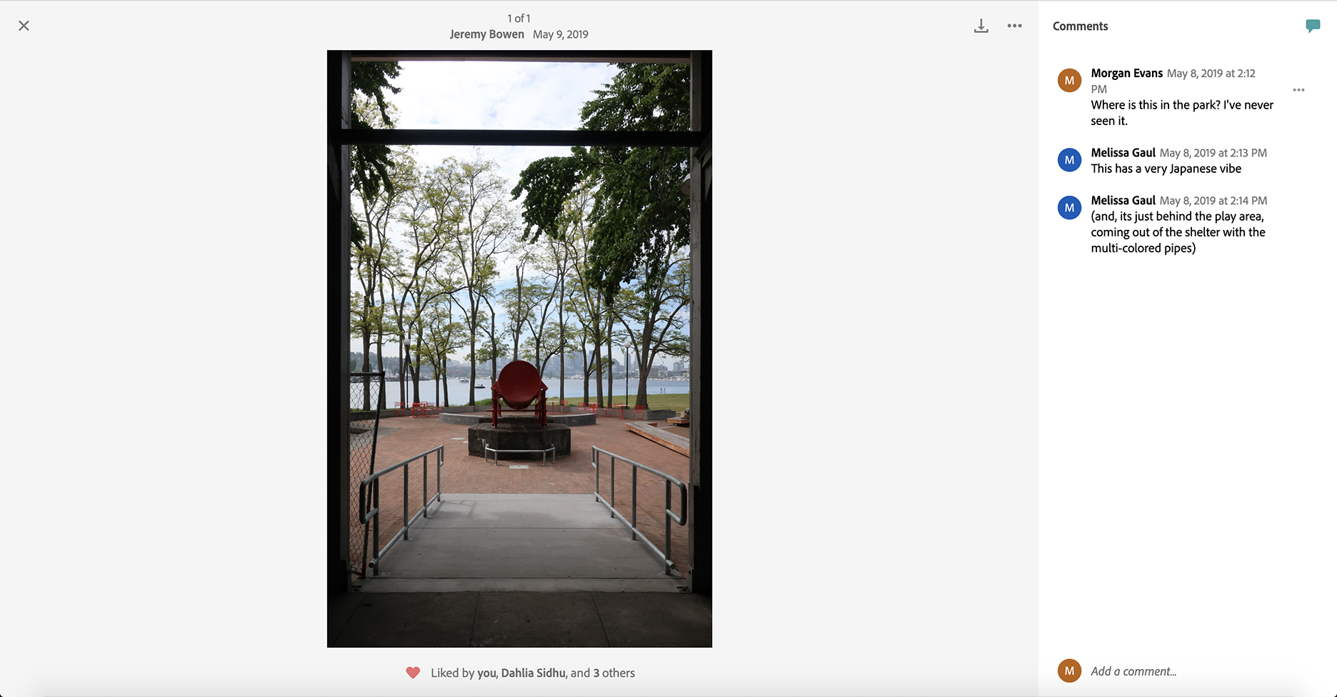
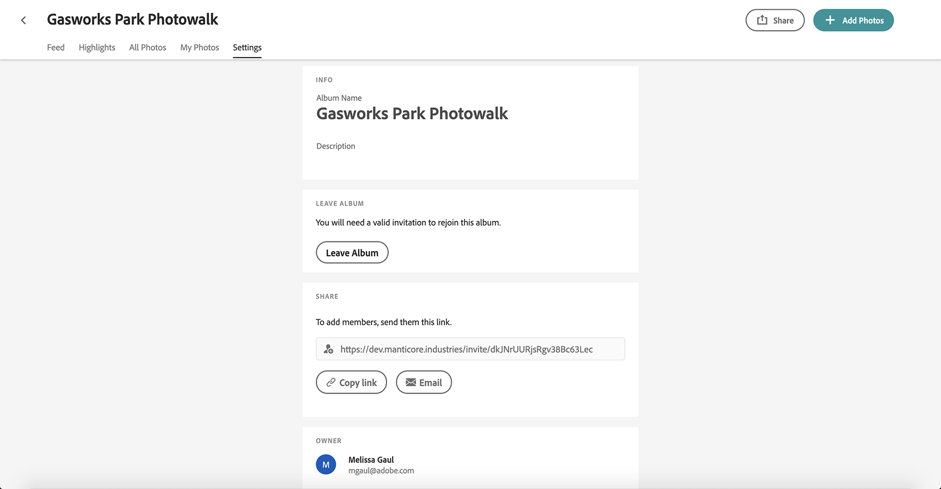
I started on the team by assisting with fairly simple UI changes in the codebase, and later moved on to being of 1 of 2 engineers implementing our final UI redesign and all ongoing feature development. The live web application can be found here. We had a "soft shipment" of the application in February 2019 and it was released internally to all employees, as well as any of their friends and family members. We had over 500 signups in the first month and generally received very positive feedback.