
nordstrom point of sale

role
UX Designer
software used
Sketch
Photoshop
Illustrator
duration
2 months
problem
The Nordstrom POS system was outdated, inefficient and costly. In turn, it hindered salespeople from performing quick and easy transactions, a core piece of Nordstrom's success, and detracted from the customer experience that Nordstrom strives to provide.
objective
Redesign the mobile and tablet Point of Sale (POS) systems used by salespeople, as well as redefining the interactions between salesperson and machine to enhance their experiences as well as the customer's in-store experience.
solution
Reimagine the POS system and create a new, modern in-house one that's functional, efficient, intuitive and cost effective. The new system should allow salespeople to provide each and every customer with the best Nordstrom experience.
My role, specifically, was to focus on the UPC and UII feature. These are the item barcodes that are scanned when an item is being purchased and contain all product information, help manage inventory, allow a customer to return an item without a receipt, etc., and are very powerful elements within the overall business.
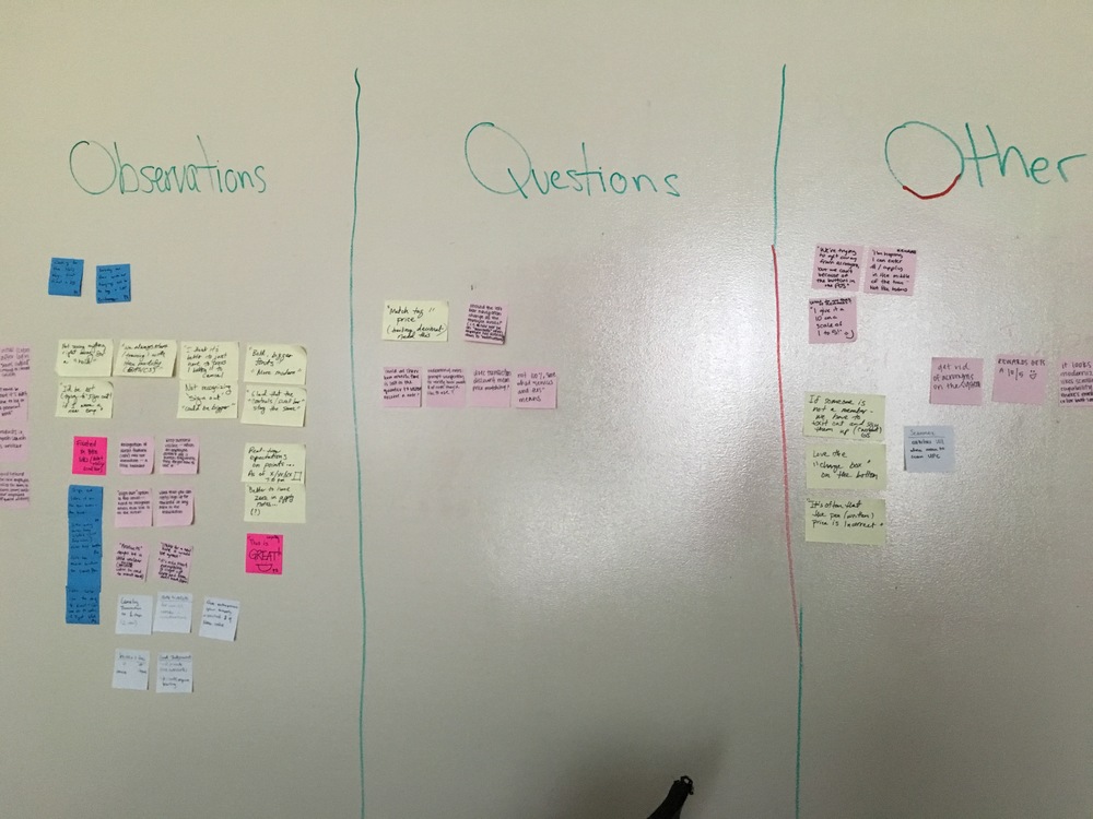
When I was placed on this project, there was an initial POS prototype in place that was being tested by the UX researchers. I attended several of the usability studies to understand how the salespeople interact with the UPC/UII barcodes during a transaction and learn more about their frustrations and what they want out of the new, customized system. Some of my key findings were: 1. salespeople wish the scanner would indicate when there is an error with a code, 2. salespeople want a clear, visual indication of when a code has been scanned and its status and 3. canceling a transaction should be a one click/swipe process.
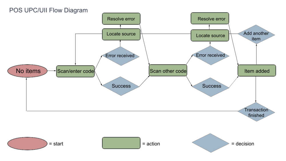
After understanding the process more, I was able to create a user flow diagram and write up 5 primary use cases of the feature.
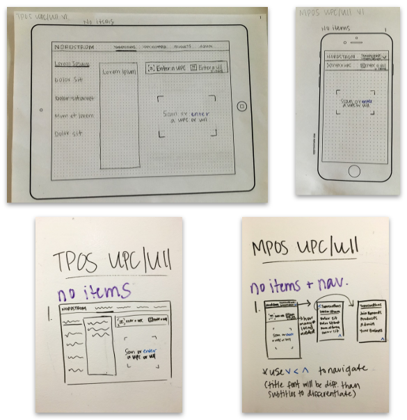
With the knowledge from the use cases and usability studies, I white boarded out the general user flows for both mobile POS (MPOS) and the tablet POS (TPOS). Afterwards, I presented the outcome to the project manager and used her feedback to refine and sketch out the screens on paper. You can view all of the paper sketches here and whiteboard sketches here.
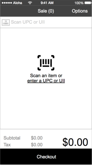
I used the POS prototype that had already been created by other designers and fleshed out the entire UPC/UII interactions, putting special emphasis on visual indicators and micro interactions. I noticed that a lot of modern input fields use floating text fields as a micro interaction, so incorporated that concept in my high fidelity prototypes (placeholder text moves upwards as the user starts typing). I held several reviews with the project manager to gather feedback before presenting the finalized prototype to the project's business leaders.
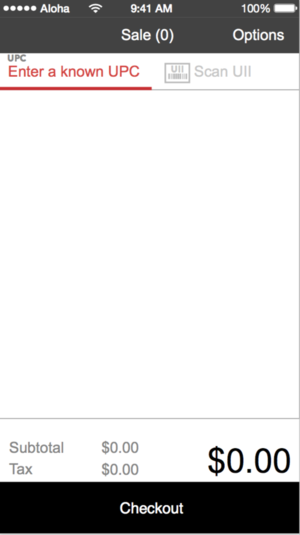
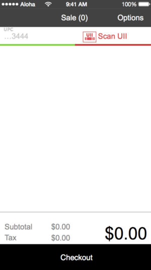
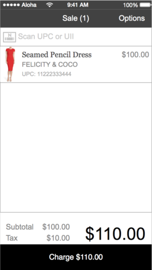
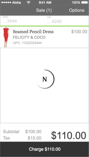
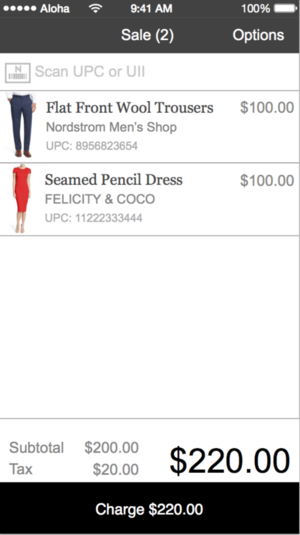
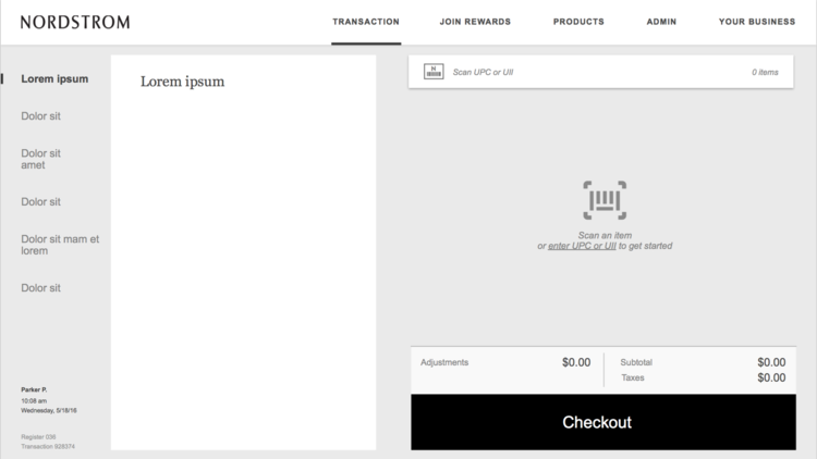
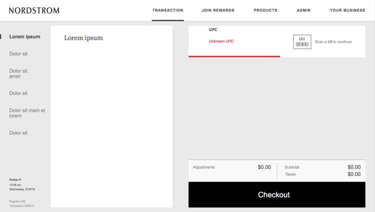
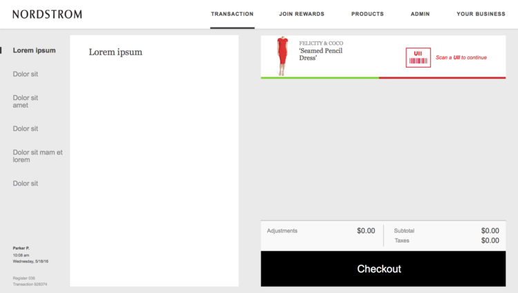
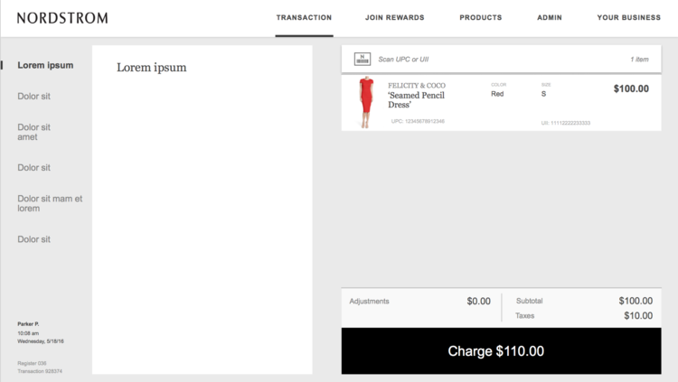
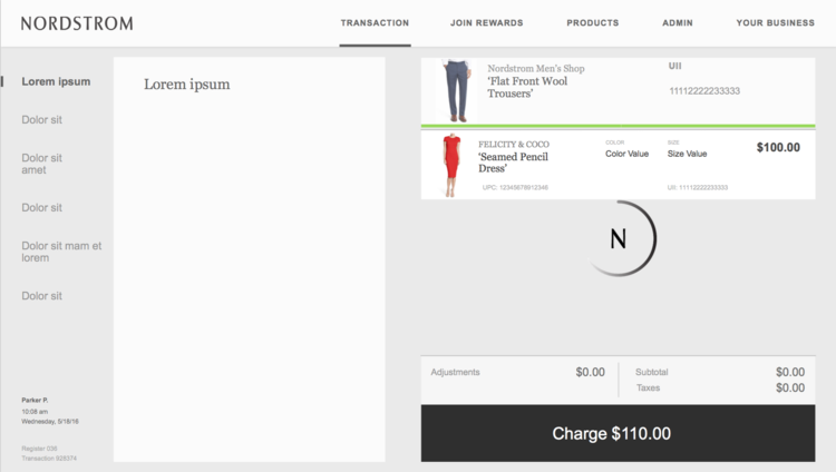
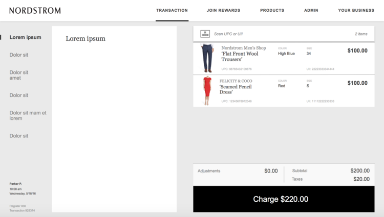
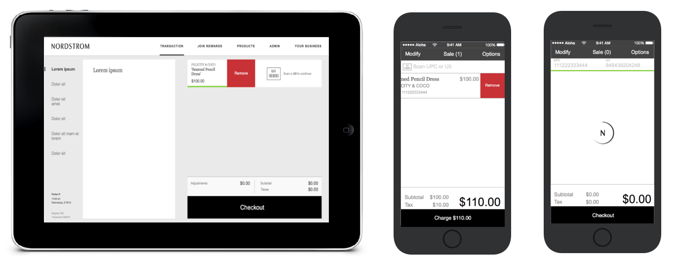
I presented my high fidelity prototype to the entire POS team, as well as its business leadership team, in a formal peer review. Afterwards, I prioritized the feedback based on company and salesperson needs and made several revisions that are displayed below (1. Swipe to remove an item in TPOS, 2. Swipe to remove an item in MPOS, 3. Display the entire UPC and UII).
This project was a great experience in seeing how a large-scale project is managed in a corporate setting and how many moving pieces and players are involved. The most difficult part of this was communicating with several different teams to figure out what is and isn't doable in terms of technology, legal and business standards and the timeline. Unfortunately, the project was put on hold and there was no more need for design efforts. However, Nordstrom set out to use a vendor solution and the designs thus far will be used to help customize the third-party system. My final internship presentation is here.